Case study · Online shop
An online shop that sells without distracting.
Maison Ondée is a botanical skincare brand imagined for this demonstration, with a young brand’s brief: six products, a local production story to tell, and a shop that makes people want to buy from their phone, with no account and no app.

Starting point
A small cosmetics brand sells first at markets and by word of mouth. The day it goes online, it often ends up with a generic shop template: identical boxes, mismatched photos, a checkout that looks like every other. What made it different disappears.
The brief comes down to three points: show the products as they really are, in one consistent light; explain what makes the brand different, short formulas and production in Bordeaux; and make buying obvious, from the first glance to the cart, without friction.
What was designed
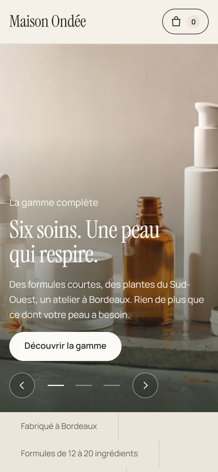
- A full-screen slideshow to open: the range, a texture, a gesture. Three slides that change slowly, with pause, arrows and keyboard navigation.
- A shop filterable by need: hydrate, soothe, cleanse, nourish. Products rearrange without reloading.
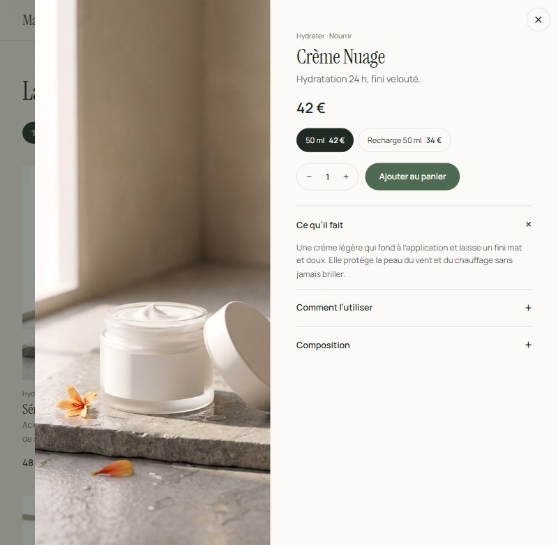
- A product panel: the full-height image, size or refill, quantity, then three sections (what it does, how to use it, ingredients).
- A side cart with a free-shipping threshold that fills up, editable quantities and a summary before ordering.
- The morning and evening ritual, in four steps, each linking to the product involved.
- Ingredients, reviews, the workshop: three sections that build trust before checkout.
Design choices
One light for the whole range. The shop’s eleven images were created for the demonstration from a single scene: wet limestone, morning light, sage and orange blossom. That consistency creates the “brand” effect far more than any logo. For a client, a photo shoot framed the same way gives the same result.
Typography from perfumery, not from a marketplace. Headlines in Instrument Serif, thin and tight; prices and buttons in Manrope. The palette comes from the products: ivory, sage, amber. No colour is there to pull the eye towards a promotion.
Motion answers a gesture. The product panel slides, the cart opens, the counter bounces on add. Beyond that, the page is calm: the slideshow is the only animation that starts on its own, and it pauses on hover or when the visitor has asked for less motion.
Honest about what is simulated. A banner at the top, a note at the bottom, and a cart that states no payment takes place: the visitor always knows they are trying a demonstration.
Technical side
One HTML page, one stylesheet, a script of about two hundred lines that drives the catalogue, filters, product panel, cart and slideshow. Photos are served in two sizes and loaded on demand. No dependencies, no third-party tools.
On a delivered shop, the catalogue and stock would come from a database or a commerce platform, payment would go through a secure provider, and each order would trigger a confirmation e-mail. The interface shown here is designed to connect to those services without being redesigned.
What a brand would receive
- The complete shop, its source files and its publication on hosting in its name.
- The real catalogue: products, sizes, refills, prices, stock.
- Payment, order e-mails and shipping tracking connected to its tools.
- A photo shoot framed for the shop, or the integration of its existing photos.
- Hands-on explanations: add a product, change a price, mark an item out of stock.
Scope, price and timing are set out in a quote before starting. A shop of this size takes a few weeks, with catalogue and photos provided.
Do you sell products online, or are you about to?
Tell me about your brand and what your shop needs to achieve. First conversation free, reply within 24 hours.
Maison Ondée is a fictional brand created for this case study. Products, prices, reviews and contact details shown on the demonstration shop are examples; the images are illustrations created for the demonstration. No payment is possible and no data entered is sent or stored.